Quite a few of my viewers requested that I continue my series of creating and presenting a “Frequency Distribution Report” using an Excel Pivot Table. So, here is the new Part 3 in the series!
In this Excel Video Tutorial, I demonstrate – using Excel 2010 – how to create a Pivot Chart for the Frequency Distribution Pivot Table that I created and modified in Parts 1 and 2 of this series.
Key Point: A Pivot Chart Must be based on a Pivot Table Report!
- Any structural changes that you make to the Pivot Table are reflected in the Pivot Chart.
- If you “filter” the Pivot Chart, those filters apply to the Pivot Table that is the basis for your Pivot Chart – and vice versa.
Focus on the Chart
As I demonstrate in this video – posted on YouTube – I prefer to focus on one task at a time. I prefer to get the formatting and structure of the Chart “right” before I think about using Filers and other “goodies to add .” This “Best Practice” helps me to get more accomplished in less time!
My bottom line is: “Focus on the task at hand. Eliminate any possible distractions from that primary task!”
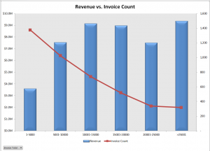
A correctly designed Pivot Chart will help you to present your information accurately and interactively! For this presentation, I decided that a “Combination Chart” would be the best way to present the information that I wanted to convey. A “Combination Chart” allows you to have a Primary Axis (Revenue) that uses a Column Chart Type and a Secondary Axis (Invoice Count) that uses a Line Chart Type.
When to Use a Secondary Chart Axis
In this example, there is a wide difference between the two fields that we are charting:
- Revenue for the Invoices in the “Bin Range” is in “the millions!
- Count of Invoices in the “Bin Range” falls into the hundreds and low thousands.
Using a “Combination Chart” in this example – (Column Chart for Revenue in Millions) and Count of Invoices (Line Chart for Count in Hundreds) allows you to present the “relationship” between both metrics. I show you step-by-step how to create this combination chart!
Watch This Video in High Definition on YouTube
Follow this link to view this video tutorial in High Definition on my YouTube Channel – DannyRocksExcels
Click this link to view Part 1 of the 3 Part series – Creating a Frequency Distribution Report with Excel Pivot Table
Click this link to view Part 2 of the 3 Part series – Formatting a Frequency Distribution Report with Excel Pivot Table


Speak Your Mind