Use SumIf and SumIfs Function in Accounts Receivable Status Report

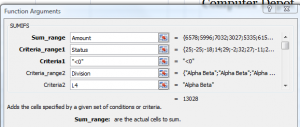
I receive many requests from viewers to help them to create and to analyze “Accounts Receivable Reports.” So, I created this Excel Video tutorial to demonstrate how both the SUMIF and the SUMIFS Functions can help you to analyze the data in an AR Status Report.

The SUMIF() Function has been available for many years in Excel – and it is a great function to use. However, starting in Excel 2007, we now have the expanded SUMIFS Function which allows us to evaluate multiple ranges using multiple criteria to return the sum of our results. This is a terrific improvement!

SUMIFS Function

SUMIFS in Excel 2007

Use SUMIFS() Function

With the SUMIFS Function, you no longer have to create multiple, complicated “nested IF Functions. Rather. you use a series of “paired arguments” – Criteria Range1, Criteria1″ etc. to define the result that you want to return.

So, with the SUMIFS() Function, you can use “paired” Criteria Ranges and Criteria to produce the exact results that you are seeking!

This, alone, may be one of the reasons to upgrade to either Excel 2007 or to Excel 2010!

Watch this Video in High Definition mode on YouTube

Here is the link to view this Excel lesson in High Definition on my YouTube Channel

You can learn how to “Master Excel in Minutes – Not Months!”

Share and Enjoy:
  • Add to favorites
  • Facebook
  • Twitter
  • Technorati
  • Print
  • email
  • Digg
  • StumbleUpon
  • del.icio.us
  • Yahoo! Buzz
  • Google Bookmarks
  • Orkut
  • SphereIt
  • Sphinn

How to Use the Average Functions in Excel 2007 and 2010

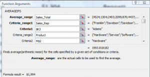
The new AVERAGEIF and AVERAGIFS Functions were introduced in Excel 2007. In this lesson, I demonstrate how and when to use both functions. If you are using an earlier version of Excel – e.g. Excel 2003, I show you how to use a Pivot Table to produce the same results.

Average is not the Median

The Average Function is the “Arithmetic Mean” of the range of cell values. This means the Sum of the values in the range divided by the Count of the cells with numeric values in the range. Many people confuse this with the MEDIAN sale which is the “middle value” in the range. Half of the cell values are above and half of the cell values are below the result of the MEDIAN() Function.

New AverageIfs Function in Excel

AverageIfs Function

New Functions in Excel 2007

Watch the video to see how to use both the AverageIf and AverageIfs Functions. I recommend using the Function Arguments Dialog Box and Named Cell References with these functions. Pay attention to my use of “Mixed Cell References” in the AverageIfs formula. Doing so makes it easy to write the formula in one cell and then copy it across the range of cells.

Here is the link to watch this video tutorial in High Definition on my YouTube Channel.

Learn how you can “Master Excel in Minutes – Not Months!”

Share and Enjoy:
  • Add to favorites
  • Facebook
  • Twitter
  • Technorati
  • Print
  • email
  • Digg
  • StumbleUpon
  • del.icio.us
  • Yahoo! Buzz
  • Google Bookmarks
  • Orkut
  • SphereIt
  • Sphinn

How to Sort Using a Custom List in Excel

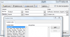
What happens when you sort a list of Months in the Year in Ascending Order? You will get “April, August …, etc.” And that, I guarantee, is not what you want! So, how do you get the list to sort as “Jan, Feb, Mar, … etc.?

Sort Using a Custom List

Sort on Custom List

Sort on Custom List

The months of the year and the days of the week are Custom Lists that are built into Excel by default. You can also create your own Custom Lists – e.g. a list of department in the order that you want to see them displayed. Once you have a Custom List saved in Excel, you can choose to sort using this order.

Watch this short video lesson to see how to create a Custom List and also how to Sort Using a Custom List in Excel.

High Definition, Full Screen Mode on YouTube

Here is the link to watch this video on my YouTube Channel – DannyRocksExcels

Learn More About Custom Lists in Excel

I have identified “Creating Custom Lists to AutoFill and Sort By” as an Essential Skill in Excel. I have created a four-hour comprehensive video training package that covers the “Nine Essential Skills in Excel.”  Click on these links to learn more about my video training resources:

Share and Enjoy:
  • Add to favorites
  • Facebook
  • Twitter
  • Technorati
  • Print
  • email
  • Digg
  • StumbleUpon
  • del.icio.us
  • Yahoo! Buzz
  • Google Bookmarks
  • Orkut
  • SphereIt
  • Sphinn

How to Generate Multiple Reports from One Pivot Table

You can create an Excel Pivot Table with just a few mouse clicks. And, with just a few more clicks, you can change – or pivot – the design of your report. Most people who use Pivot Tables know this. However, I find that most Excel users do not know that you can generate multiple reports – each one on  a separate worksheet – with just a few clicks. This is a tremendous time-saving tip!

Generate Multiple Reports

Multiple Reports

Pivot Table Report Filters

When you place one or more fields in the “Report Filters” drop zone of your Pivot Table, you will be able to generate multiple reports from one Pivot Table. Report Filters were introduced in Excel 2007. If you use an earlier version of Excel, this drop zone is called, “Pages.” Report Filters allow you to create interactive views of your data. If you use Dashboard Reports, you will want to include Report Filters in your Pivot Table.

In this video, I demonstrate how to generate reports – each on an individual worksheet – for the values in your Report Filter Field. Whenever I demonstrate this technique in a class or to a client, I always get a “gasp of excitement.” Most people say, “That’s incredible. Do that again!”

Create a Calculated Field

I also show you how to Create a Calculated Field in a Pivot Table. You do not need to return to your source data to add additional fields and then recreate your Pivot Table. Why keep redundant data? Rather, create as many Calculated Fields as you need in your Pivot Table.

Copy Your Pivot Table

You can prevent “Pivot Table Bloat” when you make copies of a Pivot Table rather than creating brand new Pivot Tables from the same source data. Watch as I demonstrate how to do this.

Follow this link to learn how you can “Quickly Create Pivot Tables and Charts”

Here is the link to watch this video in High Definition on my YouTube Channel, DannyRocksExcels

Share and Enjoy:
  • Add to favorites
  • Facebook
  • Twitter
  • Technorati
  • Print
  • email
  • Digg
  • StumbleUpon
  • del.icio.us
  • Yahoo! Buzz
  • Google Bookmarks
  • Orkut
  • SphereIt
  • Sphinn

My Best Practice Tips for Importing External Data Into Excel

I created this Excel Training Video after helping a viewer who was having difficulty getting the correct results in his Pivot Table. The problem, it turned out, was not with the Pivot Table. Rather, it was with the way his underlying data was stored and formatted.

When to Store Numbers as Text Values

Get External Data From Commands

External Data Commands

Specifically, he had combined the records from multiple workbooks into a master table. The data came from multiple main-frame computers. However, in some workbooks he had the “Invoice Number” stored as a “Numeric” value while in other workbooks it was stored – properly – as a”Text” value. Excel will treat Invoice Number 678910 stored as a number differently from the same entry (678910) stored as a text value.

Here is the “rule of thumb” to follow: Unless you will be using the SUM, AVERAGE, PRODUCT, MIN or MAX functions in a field, store numbers as “TEXT Values.” A short list includes fields for telephone number, postal codes, customer numbers and invoice numbers.

Start with the Correct Data

When you Import External Data Into Excel, start off on the right footing. Import the fields that contain Invoice Numbers, Postal Codes and Telephone numbers as “Text” values. In my experience, I have found that trying to format these fields “after the fact” does not give me the results that I was looking for. Getting the External Data fields correctly formatted at the Import Data step is the key to producing accurate and informative Excel reports.

“The 50 Best Tips for Excel 2007” DVD-ROM

Secure Shopping Cart

This is one of the 50 Video Lessons that I offer on my DVD-ROM, “The 50 Best Tips for Excel 2007.” Click here to open a Secure Shopping Cart to purchase this DVD today. I guarantee your satisfaction. I will refund your purchase price if you are not 100% satisfied with my products.

Watch in High Definition mode on YouTube

Follow this link to watch this Excel video at DannyRocksExcels on YouTube.

Share and Enjoy:
  • Add to favorites
  • Facebook
  • Twitter
  • Technorati
  • Print
  • email
  • Digg
  • StumbleUpon
  • del.icio.us
  • Yahoo! Buzz
  • Google Bookmarks
  • Orkut
  • SphereIt
  • Sphinn

How to Sort Pivot Table Field Values in Excel

With a Pivot Table, you have more options and more flexibility when it comes to sorting your field values than you do with a regular Excel data set. However, many of my clients and viewers seem to get “lost” when it comes to creating custom sorts for their Pivot Table Field Valuess. So, let me demonstrate four ways to sort fields to suit your needs.

Sorting Fields in Pivot Tables

Sort Pivot Table Fields

Sort the Order of Months


If you create a Pivot Table for a Fiscal Year or,as in this example a Water Year, you will want to sort the Month Fields to match the starting and ending months in your FY. There are at least three ways to do this:

  1. Right click on the month that you want as your first month. Choose Move from the shortcut menu and select Move (in this case) Oct to Beginning.
  2. Another way to relocate a field value is to select the bottom part of the cell. When you see the 4-heard black cross, just move the field value to the new location. You will see a Gray Horizontal Bar as you drag the field.
  3. Most amazing way to move a field value  – and seeing is believing – is to go to the cell where you want to place the field value and just “type in the name of the field value. Incredibly, Excel moves the field values to accommodate the value that you typed in! This only works with a Pivot Table.

Sort Using a Custom List

You can create a Custom List and use that for sorting the values in your Pivot Table Field. After you create your Custom List (I show you how in this video) you choose the Pivot Table Options Sort command and then choose the direction – Ascending or Descending.

In Pivot Tables, Excel remembers your custom Field Value Settings when you move – or Pivot – field from Rows to Columns for example.

 After you watch this short five minute video lesson you will know how to sort field values in Pivot Tables to suit your needs.

Pivot Table Resources

Pivot Table Training Resources

Pivot Table Training Resources

I have published 90 Minute Video Tutorials to help you to quickly master Pivot Tables. No matter which version of Excel that you are using (Excel 2010, 2007, or 2003), I offer video training that is specific to your version. You can learn more about these resources at my secure online shopping website – http://shop.thecompanyrocks.com

Learn how to “Quickly Create Pivot Tables and Charts”

Related Excel Video Lesson

My YouTube Channel – DannyRocksExcels

Click here to watch this video in High Definition, Full-screen mode

Share and Enjoy:
  • Add to favorites
  • Facebook
  • Twitter
  • Technorati
  • Print
  • email
  • Digg
  • StumbleUpon
  • del.icio.us
  • Yahoo! Buzz
  • Google Bookmarks
  • Orkut
  • SphereIt
  • Sphinn

Create a Pivot Table for a Water or Hydrological Year

A viewer asked for my help in creating a Pivot Table Report that is based on a Water Year – also known as a Hydrological Year. In North America, a Water Year begins on October 1 and ends on September 30. If you use a Fiscal Year in your reporting, you will want to watch this Excel Training Video Lesson.

Pivot Table for Water Year

Pivot Table for Water Year

Add Two Fields to Source Data

In order for a Pivot Table to summarize non-calendar years and quarters you will need to have two additional fields in your source data:

  1. A Fiscal Year (Water Year) Field – Use the IF(), MONTH() and YEAR() Functions to produce this.
  2. A Fiscal Quarter (Hydrological) Quarter Field – Use the CHOOSE() Function to produce this.

Now you are ready to create your Pivot Table Report.

Group Dates by Month and Year

Begin by grouping the Date Field by Month and Year – not, in this case, by Quarter. Now, remove the new Year field that you just created and add in the Water Year Field and the Hydrological Quarter to the Pivot Table. Continue to arrange the Pivot Table to suit your needs.

Since there is no direct way to change a Calender Year into a Fiscal Year or Water Year, you must prepare your data prior to beginning to create your Pivot Table. Now that you have watched this video lesson, you know how to do this!

Learn how to “Quickly Create Excel Pivot Tables and Charts”

Related Excel Video Lessons

Follow this link to watch this video in High Definition mode on my YouTube Channel – DannyRocksExcels

Share and Enjoy:
  • Add to favorites
  • Facebook
  • Twitter
  • Technorati
  • Print
  • email
  • Digg
  • StumbleUpon
  • del.icio.us
  • Yahoo! Buzz
  • Google Bookmarks
  • Orkut
  • SphereIt
  • Sphinn

Make it Easier to Display Large Numbers in Excel with Formatting Codes

In order to establish and maintain your credibility, the numbers that you store in Excel must be accurate and precise. You cannot compromise on this principle! In most cases, you will be working with large numbers – sometimes, very large numbers. And, this may present a problem when you need to present these numbers to your audience.

So …

It is essential that you distinguish between your need to maintain accurate “data” and your need to communicate the essential “information” that resides in your data to your audience.

Format Custom Numbers

Format Custom Numbers in Excel

When you are presenting the “essential information” that resides inside your database, you need to consider the needs of your audience.

Ask yourself these questions:

  • What essential information do you need to communicate to your audience?
  • What are the trends and variances that you see inside your data, that you want your audience to see, to understand, and take action on?
  • What level of precision do you need to convey to your audience so that they can grasp this information?
  • How can you make it easier for your audience to see – and understand – the trends and variances in your data?
  • What techniques can you use to present this information to your audience?

Apply a Custom Format to Numbers in Excel

You can answer these questions by learning how to apply “Custom Number Formatting” in Excel.

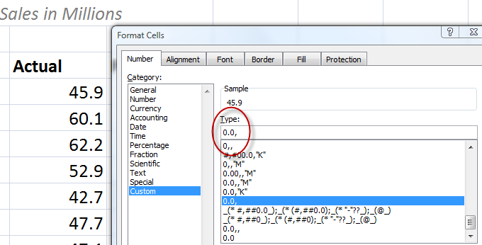
For example, instead of presenting this level of precision – 19, 699, 499, you can use this custom number format – 0.0,,”M”, to present this as 19.7M. From my perspective as both a presenter and an audience member, I prefer to see 19.7M. This makes it easier for me to process the information as an audience member. This makes it easier for me to present – saying 19,7 million is a lot easier than trying to say 19 million, 699 thousand, 4hundread and 99 dollars!

What is your preference?

Watch this short, focused Excel training video lesson to learn how to format and display large numbers in Excel so that you can make it easier for your audience to understand and act on the information that you are presenting.

Learn how to “Master Excel in Minutes – Not Months!”

Follow this link to watch this video lesson in High Definition, Full-screen mode on my YouTube Channel – DannyRocksExcels

Share and Enjoy:
  • Add to favorites
  • Facebook
  • Twitter
  • Technorati
  • Print
  • email
  • Digg
  • StumbleUpon
  • del.icio.us
  • Yahoo! Buzz
  • Google Bookmarks
  • Orkut
  • SphereIt
  • Sphinn

Creating Combination Charts in Excel

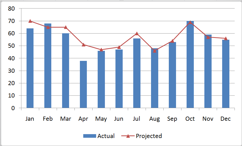
A combination chart in Excel is not a single chart type. Rather, you create combination charts by combining two or more complementary chart types. The most common combination is a Column type for one series and a Line type chart for the second series. Combination Charts, in general, make it easier to spot or highlight the trends in your data.

Combination Chart

Excel Combination Chart

 Creating a Combination Chart

  1. Create a standard chart for your data.
  2. Select one series and then choose a different chart type for that series.
  3. Make formatting choices as necessary.

Adding a Secondary Axis for Data

When you are comparing data series that have a wide “gap” between them – e.g. comparing actual sales in a month (large number) – to Profit % in each month (small number), you will want to create a Secondary Vertical (Value) Axis in your Combination Chart.

Begin by selecting the series that you want to plot and Right Mouse Click to Format the Series on a Secondary Vertical Axis. I recommend that you add in Axis Titles for both the Primary and Secondary Vertical Axes.

Formatting Charts in Excel 2007 and 2010

Charting in Excel – beginning with Version 2007 – now offers quite a few professional graphic design elements. In this video lesson, I show you how to customize the presentation of your graphical image. You can make these changes with just a few mouse clicks! It is definitely worthwhile to learn how to improve the visual impact that your Combination Charts make.

Learn how to “Master Excel in Minutes – Not Months!”

Follow this link to watch this Excel Video in High Definition, Full Screen Mode on my YouTube Channel – DannyRocksExcels

Subscribe to or watch my – free – video podcast on iTunes.

Share and Enjoy:
  • Add to favorites
  • Facebook
  • Twitter
  • Technorati
  • Print
  • email
  • Digg
  • StumbleUpon
  • del.icio.us
  • Yahoo! Buzz
  • Google Bookmarks
  • Orkut
  • SphereIt
  • Sphinn

Create Dynamic Chart Titles in Excel

A viewer wrote to ask for my help in creating dynamic chart titles in Excel. He has created a series of pivot table reports and pivot charts. He wants the titles for his charts to update dynamically. That is, as he selects a new filter for his pivot table, he wants the title in his pivot chart to match the value label in his filter.

Dynamic Chart Titles


Note: 

This technique will work for all Excel Charts and Chart Types. It is not restricted to Pivot Tables.

The solution is rather simple: You link the Chart Title to a formula.

Link Chart Title to Formula

Select a cell that is outside the range of your Pivot Table – let’s say cell H1. An example formula is:

=”Sales for Fiscal Year “&D1

In this case, cell D1 contains the label for the value that you are selecting to filter your Pivot Table Report and Chart – e.g. 2008 as your Fiscal Year.

Notice that in the formula, I include the “TEXT” inside ” ” (double quotation marks. I also use the & (ampersand) to join the text to the cell reference (D1).

Finally, select the Chart Title and then, in the formula bar type =H1 (where H1 is the cell that contains the formula that we just wrote).

As a finishing touch, you can “hide” the formula in cell H1 by changing the FONT COLOR to match the background color for that cell.

It is that easy! Try it yourself after you watch this short (6 minutes) video lesson.

Invitation to Visit My New Online Shopping Site

Shop for The 50 Best Tips for Excel 2007

Shop for The 50 Best Tips for Excel 2007

My new, secure, online shopping website – http://shop.thecompanyrocks.com – is now open. I invite you to stop by for a visit and get more information about the many resources  that I offer for sale including, “Learn how to “Master Excel in Minutes – Not Months!”

Watch Tutorial in High Definition

Follow this link to my YouTube Channel – DannyRocksExcels – where you can watch this video lesson in High Definition, Full-screen mode.

Share and Enjoy:
  • Add to favorites
  • Facebook
  • Twitter
  • Technorati
  • Print
  • email
  • Digg
  • StumbleUpon
  • del.icio.us
  • Yahoo! Buzz
  • Google Bookmarks
  • Orkut
  • SphereIt
  • Sphinn