How to Analyze Point-of-Sale Data with an Excel Pivot Table

Advantages of Pivot Tables

Advantages of Pivot Tables

This is the first in a series of tutorials that I am creating in partnership with Tri-Technical Systems – a leading provider of Point-of-sale (POS) Systems. In this video lesson, I use an Excel Pivot Table to present the information that I require from a standard “Inventory by Location” report.

Point-of-Sale Reports

Most POS Systems allow you to print out standard reports – compact, professionally formatted “snapshots” of your inventory status, sales data and customer information. Likewise, most POS Systems will allow you to easily export the data behind these reports to Excel – where you can analyze or “number crunch” the data.

Advantages of Pivot Tables

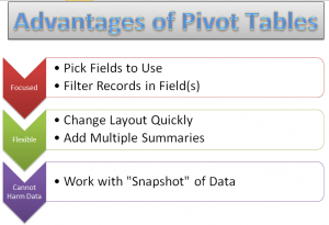
  • Pivot Tables combine the best elements of Subtotals, Outlines and Filtered Reports.
  • With a Pivot Table, you select only the Fields that you wish to focus on.
  • You can quickly reposition any field on your Pivot Table – e.g. change it from a Vertical to a Horizontal position.
  • Pivot Tables allow you to easily add multiple summaries – e.g. Sum, Average, Percentage of Total, etc. without writing a Formula!
  • It is impossible to harm your underlying data when you work with a Pivot Table because you are working with a “virtual snapshot” of your data. You cannot directly change any value in a Pivot Table Report!

Learn More About Pivot Tables

Pivot Tables are easy to learn. However, it does take practice if you want to really tap into the analytical power of  a Pivot Table Report. Fortunately, I have a great resource for you – a 90 minute focused video tutorial on Pivot Tables. Follow this link to go to the information page for my Excel 2010 Pivot Table DVD-ROM. I have also created Pivot Table videos for Excel 2007 and Excel 2003.

Watch Tutorial in High Definition

You can watch this Excel Tutorial in High Definition on my YouTube Channel – DannyRocksExcels

View My Video Now
 

Share and Enjoy:
  • Add to favorites
  • Facebook
  • Twitter
  • Technorati
  • Print
  • email
  • Digg
  • StumbleUpon
  • del.icio.us
  • Yahoo! Buzz
  • Google Bookmarks
  • Orkut
  • SphereIt
  • Sphinn

How to Use the New Natural Language Date Filters in Excel

Natural Language Date Filters

Natural Language Date Filters

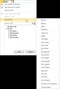
Recently, one of my viewers asked me to go into greater detail in demonstrating how the new Natural Language Date Filters work in Excel. Natural Language Filters were introduced in Excel 2007 and they are a great tool to use! Now, instead of writing complex formulas as criteria in Advanced Filters, you can simply click, “Yesterday” to see all of the records from the previous day!

Of course, you must actually have records in your data set for that date!

The Natural Language Date Filters are related, by position, to TODAY(). The TODAY() Function is a “Volatile Function” that returns the value for the current date as found in your computer systems internal clock. The result of the TODAY() Function will change each day. And so, by definition, will the result for a “Yesterday” filter!

Filter for Specific Date

There are several methods that you can use to filter for a specific date or range of dates. One method that I demonstrate in this tutorial is the “Custom Date” dialog box.

Watch Tutorial in High Definition

Follow this link to watch this Excel Tutorial in High Definition on my YouTube Channel – DannyRocksExcels

Learn About My New Extended Length Video Tutorials

I have recently released a series of extended length (90 minutes) video tutorials. They are part of my “Master Excel in Minutes” Series. Each video focuses on one topic. My first video is focused on Excel Pivot Tables. I have created Videos for Excel 2010, Excel 2007 and for Excel 2003. You also have the choice of purchasing the video for immediate downloading or shipped to you on a DVD-ROM.

Follow this link to go to the information page for my “Master Excel in Minutes” video tutorial series.

Share and Enjoy:
  • Add to favorites
  • Facebook
  • Twitter
  • Technorati
  • Print
  • email
  • Digg
  • StumbleUpon
  • del.icio.us
  • Yahoo! Buzz
  • Google Bookmarks
  • Orkut
  • SphereIt
  • Sphinn

Master Excel Pivot Tables in 90 Minutes: Announcing My New Extended Length Video Tutorials!

Master Pivot Tables in Minutes

Master Pivot Tables in Minutes

I am proud to announce the publication of my new series of “Extended Length” video tutorials: “Master Excel Pivot Tables in 90 Minutes!”

Now, you can can get an in-depth video tutorial, so that you can Master Excel Pivot Tables with 90 minutes of video instruction. You also receive the actual Excel Workbook file that I used while filming the video lessons as well as a printed step-by-step instructional manual.

What Makes this Product Unique?

  •  Excel Versions for the Video Tutorials

  • Available for Excel 2010, Excel 2007 or Excel 2003

Multiple Options for Delivery

Resources to Assist Your Learning

  • The Excel Workbook file that I used while filming each video lesson – Included with purchase!
  • PDF Manual of Step-by-Step Instructions – That you can print out – Included with purchase!

Take a Short Video Tour

Follow this link to watch a short – 5 minutes – video tour of my new products on my YouTube Channel – DannyRocksExcels

Visit My New Secure Online Shopping Website

I invite you to visit http://shop.thecompanyrocks.com This is my new online shopping website. I have created secure shopping carts to ensure that your privacy is protected. I also offer a 100% Customer Satisfaction Policy. If, for any reason, you are not 100% satisfied with any of my products, I will refund your purchase with no questions asked!

Danny Rocks

The Company Rocks

Share and Enjoy:
  • Add to favorites
  • Facebook
  • Twitter
  • Technorati
  • Print
  • email
  • Digg
  • StumbleUpon
  • del.icio.us
  • Yahoo! Buzz
  • Google Bookmarks
  • Orkut
  • SphereIt
  • Sphinn

How to Use the Show As Values Dialog Box for an Excel Pivot Table

Show Values As for Pivot Table

Show Values As for Pivot Table

I created this Excel Video Tutorial in response to a viewer who wrote to me about a problem that he was having with an Excel 2007 Pivot Table.

Viewer’s Question

“I want to show both the % of Growth from Fiscal Year-to-Year and the Actual Variance in Volume between each of 3 Fiscal Years. I have been trying to do this with a Pivot Table Calculated Field, but I am not having any luck with this approach. What do you suggest?”

My Solution

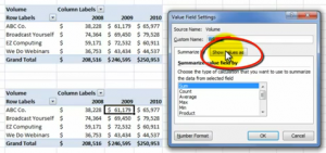
Use the “Show values As” Dialog Box which you find in the Value Field Settings Dialog Box. I continue to be amazed, when I teach Pivot Tables in a Live Seminar, that the high majority of my students have never clicked on this Tab!

In this case, we are working with a “copy” of the original Pivot Table. Simply choose “% Difference From” in the drop-down menu. Next, choose Fiscal Year and Previous (year) to create a Fiscal Year-over_Fiscal Year Report. It is so easy to do! And… you do not have to write a single formula to create this report!

Watch Video Here on My Website


Watch Excel Tutorial in High Definition

Follow this link to view this Excel Tutorial in High Definition Mode on my YouTube Channel – DannyRocksExcels

Master Excel Pivot Tables in 90 Minutes!

Follow this link to learn about my new extended length (90 minutes) Pivot Table Video Tutorials

Share and Enjoy:
  • Add to favorites
  • Facebook
  • Twitter
  • Technorati
  • Print
  • email
  • Digg
  • StumbleUpon
  • del.icio.us
  • Yahoo! Buzz
  • Google Bookmarks
  • Orkut
  • SphereIt
  • Sphinn

Use the Show Values As Formulas in Excel Pivot Tables

Show Values As

Show Values As in Pivot Table

I participate in a number of Group Discussion Boards on LinkedIn. In this video tutorial, I address one question that was recently asked:

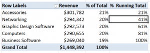
“Is it possible to show a Percentage of Running Total formula in a Pivot Table?”

The answer is, “Yes, if you are using Excel 2010. If you are using earlier versions of Excel, you can use a work-around outside the Pivot Table.”

New in Excel 2010

A great new feature introduced in Excel 2010 is the drop-down menu for the “Show Values As’ in a Pivot Table Calculation. In earlier versions of Excel, the Show Values As option was not so obvious. And, I found that many of my clients did not know how to use it – or could not locate the drop-down menu.

Work-Around for Show % of Running Total

While the “Running Total in…” calculation has been available for quite some time, the “% of Running Total in …” formula is brand new in Excel 2010. The work-around that I demonstrate is to first, create the Show As “Running Total in …” formula. Then change the Font and background of these cells to “White.” Next, write a standard formula “outside of the Pivot Table” that references these cells. Be sure to turn off the “GetPivotData” Formula when you write this formula.

Download Extended Length Pivot Table Video Tutorials

Click on this link to learn about my new “extended length” video tutorials for Pivot Tables. They are availabe for Excel 2003, Excel 2007 and Excel 2010.

Watch Video in High Definition on YouTube

Follow this link to watch this video in High Definition on my YouTube Channel – DannyRocksExcels

Master Excel Pivot Tables in 90 Minutes

Follow this link to learn about my new “Extended Length” – 90 Minutes – Video Tutorials


Share and Enjoy:
  • Add to favorites
  • Facebook
  • Twitter
  • Technorati
  • Print
  • email
  • Digg
  • StumbleUpon
  • del.icio.us
  • Yahoo! Buzz
  • Google Bookmarks
  • Orkut
  • SphereIt
  • Sphinn

3 Work-Arounds for Shortcomings in Calculated Fields in Excel Pivot Tables

Excel Work-arounds

3 Work-Arounds for Calculated Fields

Don’t get me wrong. Excel Pivot Tables are a great way to summarize, analyze and present the information in your data. And, creating Calculated Fields in Pivot Tables is a terrific way to extend your analysis.

However, there are a few “quirks” that you should be aware of when using a Calculated Field”

A Calculated Field is always performed against the SUM of your data!

Well, what if you want to calculate against the MIN or the MAX of your data? Or perform some other calculation?

3 Work-Arounds for Calculated Field Shortcomings

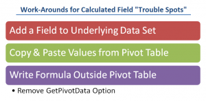
I encourage you to look at a Pivot Table as “a means to an end.” Let your Pivot Table take you to the 90% completion point – and a Pivot Table does this very well! Then, use one of these 3 strategies to help you to complete your analysis.

  1. Sometimes, you simply must return to your source data and add an additional field so that your Pivot Table has more information to work with.
  2. You can make a copy of your Pivot Table and then Paste Special the Values to another location. From there, you can complete your analysis with more flexibility.
  3. You can create formulas outside of the Pivot Table – as I demonstrate in this video, deselect the “pesky” GetPivotData Function first. There are some limitations here:
  1. Remember that all cell references in your formula must appear in your Pivot Table
  2. Your Pivot Table must essentially remain “static” – e.g. no more fields added or subtracted, etc.

Watch Video Tutorial in High Definition on YouTube

This video lesson is longer in length than normal. To watch it in High Definition, click on this link to go to my YouTube Channel – DannyRocksExcels

Download Extended Length Video Tutorials for Pivot Tables

I have created extended length video tutorial recordings for Pivot Tables in Excel 2003, Excel 2007, and Excel 2010. You can download them for only $9.95 USD.

Click on this link to get more information about my Excel Extended Length Video Recordings.


Share and Enjoy:
  • Add to favorites
  • Facebook
  • Twitter
  • Technorati
  • Print
  • email
  • Digg
  • StumbleUpon
  • del.icio.us
  • Yahoo! Buzz
  • Google Bookmarks
  • Orkut
  • SphereIt
  • Sphinn

How to Drill Down in a Pivot Table to Display the Details for a Summary Cell

Drill Down in a Pivot Table

Drill Down Details in Pivot Table

Excel Pivot Table Reports are a great way to summarize the results of multiple records in an underlying data set.

However, at some point, someone will question the accuracy of a specific calculation in your Pivot Table – this is to be expected.

When this happens. you can quickly “drill down” to display the details for any summary cell in your Pivot Table. You simply “double-click” the summary cell and you get to review the detail on a new worksheet in your Excel workbook.

Refreshing a Pivot Table

The key points to understand about Excel Pivot Tables are:

  • You cannot change an individual value in a Pivot Table.
  • You cannot update any changes from a “drill down” worksheet in a Pivot Table.
  • After you edit your underlying data set, you must “Refresh” your Pivot Table to get the revised calculations.

Formatting “Blank Cells” in a Pivot Table

One aspect of Pivot Tables – displaying “blank cells” – is disconcerting to many people who are using or viewing Pivot Tables for the first time. In this video tutorial, I demonstrate how to customize the display of these cells that have no underlying values to calculate.

View this Tutorial in High Definition

Follow this link to watch this video tutorial in High Defintion on my YouTube Channel – DannyRocksExcels

Master Excel Pivot Tables in 90 Minutes!

Click this link to find out how to download or purchase a DVD-ROM of my extended length video tutorials for Excel Pivot Tables.

Share and Enjoy:
  • Add to favorites
  • Facebook
  • Twitter
  • Technorati
  • Print
  • email
  • Digg
  • StumbleUpon
  • del.icio.us
  • Yahoo! Buzz
  • Google Bookmarks
  • Orkut
  • SphereIt
  • Sphinn

Create a Pivot Chart to Present a Frequency Distribution Report

Combination Chart for Frequency Report

Quite a few of my viewers requested that I continue my series of creating and presenting a “Frequency Distribution Report” using an Excel Pivot Table. So, here is the new Part 3 in the series!

In this Excel Video Tutorial, I demonstrate – using Excel 2010 – how to create a Pivot Chart for the Frequency Distribution Pivot Table that I created and modified in Parts 1 and 2 of this series.

Key Point: A Pivot Chart Must be based on a Pivot Table Report!

  • Any structural changes that you make to the Pivot Table are reflected in the Pivot Chart.
  • If you “filter” the Pivot Chart, those filters apply to the Pivot Table that is the basis for your Pivot Chart – and vice versa.

Focus on the Chart

As I demonstrate in this video – posted on YouTube – I prefer to focus on one task at a time. I prefer to get the formatting and structure of the Chart “right” before I think about using Filers and other “goodies to add .” This “Best Practice” helps me to get more accomplished in less time!

My bottom line is: “Focus on the task at hand. Eliminate any possible distractions from that primary task!”

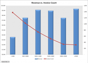
A correctly designed Pivot Chart will help you to present your information accurately and interactively! For this presentation, I decided that a “Combination Chart” would be the best way to present the information that I wanted to convey. A “Combination Chart” allows you to have a Primary Axis (Revenue) that uses a Column Chart Type and a Secondary Axis (Invoice Count) that uses a Line Chart Type.

When to Use a Secondary Chart Axis

In this example, there is a wide difference between the two fields that we are charting:

  • Revenue for the Invoices in the “Bin Range” is in “the millions!
  • Count of Invoices in the “Bin Range” falls into the hundreds and low thousands.

Using a “Combination Chart” in this example – (Column Chart for Revenue in Millions) and Count of Invoices (Line Chart for Count in Hundreds) allows you to present the “relationship” between both metrics. I show you step-by-step how to create this combination chart!


Watch This Video in High Definition on YouTube

Follow this link to view this video tutorial in High Definition on my YouTube Channel – DannyRocksExcels

Click this link to view Part 1 of the 3 Part series – Creating a Frequency Distribution  Report with Excel Pivot Table

Click this link to view Part 2 of the 3 Part series – Formatting a Frequency Distribution Report with Excel Pivot Table

Share and Enjoy:
  • Add to favorites
  • Facebook
  • Twitter
  • Technorati
  • Print
  • email
  • Digg
  • StumbleUpon
  • del.icio.us
  • Yahoo! Buzz
  • Google Bookmarks
  • Orkut
  • SphereIt
  • Sphinn

Formatting an Excel Pivot Table Frequency Report

Show % in Frequency Report

Show % of in Frequency Report

This is Part 2 of my 2-part series on Excel Pivot Table Frequency Reports. A Frequency Report is a great way to answer these questions:

  • How many invoices did we generate for values under $5,000?
  • How many invoices did we gererate for values over $15,000?

In this part, I show you how to format the Frequency Report to make it easier to present the information.

Formatting the Frequency Report

Here are the changes that I made to improve the look of the Frequency Report:

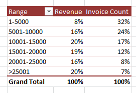
  • Reduced the number of “bins” in the frequency range by changing the “Grouping.”
  • Changed the formatting to make large numbers (millions) easier to read – e.g. as $3.2M
  • Made a copy of the Pivot Table to show values as “% of Total.”

Click on this link to go to Part 1 in this series of video tutorials for Pivot Table Frequency Reports

Learn How to Use Pivot Tables

I have created a series of video tutorials that you can download to learn how to create and modify Excel Pivot Tables. You can choose to download the recording that fits your version of Excel (2003, 2007 or Excel 2010). The cost is $9.95 for the video recording and that includes the Excel workbooks that I used and a step-by-step instructional manual. Follow this link to get more information about these recordings.

Watch this Video in High Definition on YouTube

Follow this link to watch this video tutorial on my YouTube Channel – DannyRocksExcels

Share and Enjoy:
  • Add to favorites
  • Facebook
  • Twitter
  • Technorati
  • Print
  • email
  • Digg
  • StumbleUpon
  • del.icio.us
  • Yahoo! Buzz
  • Google Bookmarks
  • Orkut
  • SphereIt
  • Sphinn

Use Excel Pivot Table to Determine Frequency Distribution of Invoice Amounts

Frequency Distribution

Frequency Distribution of Invoices

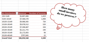
Has your manager ever asked you,  “How many small invoices do we process?” Of course, you do not know that number immediately. However, you can produce the answer within about 2 minutes when you use an Excel Pivot Table.

Amazing?

Group Fields in a Pivot Table

Yes. And, easy to produce thanks to the “Group Fields” tools in an Excel Pivot Table – in any version of Excel!

In fact, I demonstrate how to produce the frequency distribution in:

  • Excel 2010 / Excel 2007
  • Excel 2003

Download My Pivot Table Video Recordings

This give me the opportunity to announce that I have published a series of Video Tutorial Recordings for Excel Pivot Tables – on my WebEx by Cisco website –  that you can download for only $9.95 USD!

Follow this link to get more information and to follow the direct links to download these recordings.

It is so easy to produce this Pivot Table report that you will be amazed – and want to learn more. That is why I have decided to produce a sequel to this lesson. I will post Part 2 tomorrow. In that segment, I will help you to answer your manager’s question – “How many of these invoices do we process each your?”

Just make me one promise! Do not tell your manager how easy it is to produce these reports!

Of course, I am joking about this. But, most people who do not work with Pivot Tables on a regular basis have no idea how easy it is to harness the analytical and presentation power of Pivot Tables. Once you watch these lessons – and download my video recordings – you will know a lot more about Pivot Tables.

Watch This Video in High Definition on YouTube

Click here to watch this video on my YouTube Channel – DannyRocksExcels – in High Definition

Click here to go to Part 2 in this series – Formatting a Frequency Distribution Report for Presentation

Share and Enjoy:
  • Add to favorites
  • Facebook
  • Twitter
  • Technorati
  • Print
  • email
  • Digg
  • StumbleUpon
  • del.icio.us
  • Yahoo! Buzz
  • Google Bookmarks
  • Orkut
  • SphereIt
  • Sphinn