My Most Viewed and Downloaded Videos for Excel and PowerPoint

My iTunes Podcast

Danny on iTunes

I began to post my videos as podcasts at the iTunes store this past summer. Since then, my video lessons for Excel and PowerPoint have been viewed and downloaded many times. I am thirlled. And, I thank you for your support and encouragement.

Here are the links – on my website – to the most popular video episodes. I have organized them by category in the order of their popularity. You can click on any link to view or download that video from my website. Or, you can go to my video Podcast by clicking on this link – “Danny Rocks Tips and Timesavers” Podcast on iTunes.

Merging and Consolidating Excel Worksheets

 PowerPoint Presentations

Data Visualizations

What-If Analysis in Excel

Importing Data From Other Programs

Pivot Tables

Excel Tables

Social Media

Formula Errors

Please add your comments below – or on my iTunes Channel. I welcome your feedback.

You can learn how to “Master Excel in Minutes – Not Months!”

Sincerely,

Danny Rocks

Share and Enjoy:
  • Add to favorites
  • Facebook
  • Twitter
  • Technorati
  • Print
  • email
  • Digg
  • StumbleUpon
  • del.icio.us
  • Yahoo! Buzz
  • Google Bookmarks
  • Orkut
  • SphereIt
  • Sphinn

How to Create a Pivot Table Year-to-Year Comparison Report

One of my viewers asked for my help in creating and Excel Pivot Table Report. She wants to compare the total number of units shipped during three time periods: the years 2008, 2009 and 2010. The trick to producing this report is to drag the field to be summarized – Units Shipped – to the Values Area three times. Then, you change the Value Field Settings to first Sum the Units, then to compare the change in units year-over-year and finally to express this as a percentage of change. This creates a Year-to-Year Comparison Report.

This is a tip that is best demonstrated visually. So, I invite you to watch this 6 minute and 55 second Excel Video Training Lesson.

If you do not have the time to watch the video now, you can use my RSS Feed to deliver it to your computer or you can subscribe to my Video Podcast on iTunes to watch it later.

Learn how to “Quickly Create Pivot Table Reports and Charts”

Share and Enjoy:
  • Add to favorites
  • Facebook
  • Twitter
  • Technorati
  • Print
  • email
  • Digg
  • StumbleUpon
  • del.icio.us
  • Yahoo! Buzz
  • Google Bookmarks
  • Orkut
  • SphereIt
  • Sphinn

How to Create and Modify Excel Pivot Tables

How is it possible that the most powerful tool in Excel is also one of the easiest tools to use? An Excel Pivot Table is, in my opinion, the most powerful tool for analyzing data and presenting it as valuable and actionable information. And, an Excel Pivot Table is also one of the easiest tools to use.  

Summarize Data with Pivot Tables

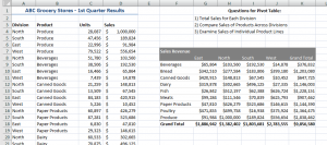
Create a Pivot Table

Create a Pivot Table in six steps:  

  1. With one cell in the data table selected, I clicked on the Insert Tab of the Ribbon and clicked Pivot Table.
  2. I made one change to the default settings – I clicked a cell on the current worksheet to place my Pivot Table.
  3. On the Pivot Table Field List, I placed the Division Field in the Columns area and the Products Field  in the Rows area,
  4. Also on the Pivot Table Field List, I placed the Sales Field in the Values area.
  5. To format the Sales field Subtotals, I Right-clicked a single number and chose Value Field Settings – Number Format.
  6. I also changed the name from “Sum of Sales” to “Sales Revenue.”

It’s that easy! Try it yourself. You will be amazed at how easy it is to create your first Pivot Table. And… as an added bonus, with a Pivot Table you can not harm the underlying data! Pivot Tables work with a “virtual snapshot” of your actual data. Because a Pivot Table uses a “memory cache”  of your data, you can quickly swap your data fields from Rows to Columns to Filters, etc. This is done quickly and efficiently. 

Learn how to “Quickly Create Excel Pivot Table Reports and Charts.”

Here, on the website of The Company Rocks, I offer many free Excel Training Videos to help you get started to create and modify Excel Pivot Tables. Here are the links to the Introductory set of Pivot Table video lessons: 

You can also search for free Excel Pivot Table Video Lessons by following these links: 

“The 50 Best Tips for Excel 2007” DVD

Excel Tip List

Excel DVD Tips

You can also purchase my DVD, “The 50 Best Tips for Excel 2007.”It is affordable and it offers over 5 1/2 hours of focused Excel training tips, tricks and techniques. 

Follow this link to start shopping with my secure shopping cart. I guarantee that you will enjoy my Excel Video Tips. If you are not 100% satisfied, I will refund your purchase price with no questions asked!

Share and Enjoy:
  • Add to favorites
  • Facebook
  • Twitter
  • Technorati
  • Print
  • email
  • Digg
  • StumbleUpon
  • del.icio.us
  • Yahoo! Buzz
  • Google Bookmarks
  • Orkut
  • SphereIt
  • Sphinn

Two Ways to Create a Frequency Distribution in Excel

What is a “Frequency Distribution?” A good example is to see how frequently daily sales are “under $75.00” or how often they range “between $75.00 and $150.00.” Once you know how frequently a result occurs, you can better focus your attention on that particular segment of your business.

In this short 5 minute and 45 second Excel Training Video Lesson, I demonstrate two approaches to creating a Frequency Distribution Report:

  1. Use the =FREQUENCY() Function – this is an ARRAY Function.
  2. In a Pivot Table, Group the Row Labels to produce a Frequency Distribution.

An ARRAY Function has two “Got’cha steps:”

  1. Select all of the cells that will contain the results before your enter your Array Formula.
  2. Use the Ctrl + Shift + Enter keyboard combination to enter your Array Formula.

You can watch this video here on my website, you can download it via an RSS Feed or you can watch it as a Podcast at the iTunes Store.

Learn how to “Master Excel in Minutes – Not Months!”

Share and Enjoy:
  • Add to favorites
  • Facebook
  • Twitter
  • Technorati
  • Print
  • email
  • Digg
  • StumbleUpon
  • del.icio.us
  • Yahoo! Buzz
  • Google Bookmarks
  • Orkut
  • SphereIt
  • Sphinn

Two Ways to Produce an Executive Summary of an Excel List

On one of the technology blogs that I follow, there is a debate over the best way to produce an Executive Summary of the information in an Excel Data List. Some people like the idea of using Excel’s =SUMIF() Function for this while others recommend creating a Pivot Table as the summary.

You decide – after watching this short video demonstration using both approaches. And, add a comment or drop me an email to let me know your thoughts.

This Excel Video Lesson is available for you to download as a Podcast on iTunes.

Follow this link to go to the “Danny Rocks Tips and Timesavers” podcast.

Learn how to “Master Excel in Minutes – Not Months!”

Share and Enjoy:
  • Add to favorites
  • Facebook
  • Twitter
  • Technorati
  • Print
  • email
  • Digg
  • StumbleUpon
  • del.icio.us
  • Yahoo! Buzz
  • Google Bookmarks
  • Orkut
  • SphereIt
  • Sphinn

Show Percentage of Calculations in Pivot Tables

Most people are content to let a Pivot Table Sum, Average, or Count their Values Fields. But what if you want to see individual Products as a percentage of all products sold in a Region – this is a standard request for Excel. And … it is easy to perform this calculation in a Pivot Table. Let me show you how to do this.

Follow this link to subscribe to the Danny Rocks “Tips and Timesavers” Podcast at the iTunes Store.

Learn how to “Quickly Create Pivot Tables and Charts in Excel.”

Share and Enjoy:
  • Add to favorites
  • Facebook
  • Twitter
  • Technorati
  • Print
  • email
  • Digg
  • StumbleUpon
  • del.icio.us
  • Yahoo! Buzz
  • Google Bookmarks
  • Orkut
  • SphereIt
  • Sphinn

Dynamically Expand the Source Data for Pivot Tables in Excel 2007

Without question, the new Tables Tools is my favorite feature  in Excel 2007 – this feature, alone, is worth the price to upgrade!

When you format a Data Range as a Table in Excel 2007, you can “append” new data to the table and the Table definition automatically expands to incorporate the new cells! If you create Pivot Tables based on a “Named Range” for your source data, this is GREAT NEWS!

Now, after appending the new data to your “Named Table: in Excel 2007, when you refresh your Pivot Table, you automatically get updated data in your Pivot Table report.

This can save you hours each month – at what – $50.00 per hour? $100.00 per hour? Watch these savings add up each month of the year

(Note: This is a re-post so that I can feed this video to my Podcast at the iTunes store.)

Follow this link, to view and download – for free – the episodes on my Podcast, “Danny Rocks Tips and Timesavers” at the iTunes store.

Learn how to “Quickly Create Excel Pivot Tables and Charts.”

Share and Enjoy:
  • Add to favorites
  • Facebook
  • Twitter
  • Technorati
  • Print
  • email
  • Digg
  • StumbleUpon
  • del.icio.us
  • Yahoo! Buzz
  • Google Bookmarks
  • Orkut
  • SphereIt
  • Sphinn

Create a Month, Quarter, Year Report with 10 Mouse Clicks Using Pivot Tables

With an Excel Pivot Table you can transform thousand of rows of transactions into a neat summary by month, quarter and year using @ 10 mouse clicks!

I invite you to visit my online shopping site to purchase my DVD “The 50 Best Tips for Excel 2007.

(Note: This is a re-post so that I can send this video to my Podcast on iTunes.)

Follow this link to view or subscribe to my Podcast at iTunes

Learn how to “Quickly Create Pivot Tables and Charts.”

Share and Enjoy:
  • Add to favorites
  • Facebook
  • Twitter
  • Technorati
  • Print
  • email
  • Digg
  • StumbleUpon
  • del.icio.us
  • Yahoo! Buzz
  • Google Bookmarks
  • Orkut
  • SphereIt
  • Sphinn

Summarize Fiscal Year by Month and Quarter with a Pivot Table

Excel Pivot Tables can quickly group dates by Month, Quarter and Year. If your company uses a Fiscal Year,  then be sure that your source data contains columns to identify the Fiscal Year and the Fiscal Quarter before you create the Pivot Table. Watch how this is done.

(Note: This is a re-post so that I can send this video to my Podcast at the iTunes store.)

Follow this link to view and subscribe to my Tips and Timesavers Podcast on iTunes.

I invite you to visit my online store to learn about my DVD series, “The 50 Best Tips for …”

Learn how to “Quickly Create Excel Pivot Tables.”

Share and Enjoy:
  • Add to favorites
  • Facebook
  • Twitter
  • Technorati
  • Print
  • email
  • Digg
  • StumbleUpon
  • del.icio.us
  • Yahoo! Buzz
  • Google Bookmarks
  • Orkut
  • SphereIt
  • Sphinn

Danny Rocks Tips and Timesavers

Many people would like to know how to create Pivot Tables in Excel, but they are afraid to try them because they fear that they will “harm the data”in the source worksheet. Here is the good news! With a Pivot Table, you cannot possibly harm or even change the source data!
Watch as I show you how to create a Pivot Table – you will be amazed at how easy they are to create, and even more amazed at how powerful they are in helping you to analyze your data.
(Note: This is a repost. I am now making many of my video lessons available – for free – as Podcasts and I need to feed them to the iTunes store.)
Share and Enjoy:
  • Add to favorites
  • Facebook
  • Twitter
  • Technorati
  • Print
  • email
  • Digg
  • StumbleUpon
  • del.icio.us
  • Yahoo! Buzz
  • Google Bookmarks
  • Orkut
  • SphereIt
  • Sphinn