Don’t Retype! Import a MS Word Outline into PowerPoint

Today’s video tutorial is in response to a viewer’s request. She has a series of MS Word documents created as Outlines. Her new boss wants her to transfer the Outlines into MS PowerPoint. She really does not want to learn PowerPoint. And she definitely does not want to re-type her outlines.

Watch as I demonstrate three ways to import MS Word Outlines into MS PowerPoint.

50 Best Tips Series

50 Best Tips DVD

Here are the steps to follow in this video tutorial:

  • To create a new PowerPoint Presentation. From within PowerPoint, choose File, Open. In the “Files of Type” drop-down menu choose “All Outlines.
  • Be sure that your MS Word document with the outline is closed before you select it!
  • The MS Word Outline is quickly transformed into a PowerPoint Presentation!
  • For the 2nd technique, we are working inside MS Word. We do not have to leave the program. Simply choose File, Send To – MS Office PowerPoint. PowerPoint opens and the Word document is now a PowerPoint Presentation!
  • Tips: While working in MS Word – strip away all manually applied formats (Fonts, Bullet Points, etc.) A keyboard shortcut: Ctrl+A to “Select All” (of the document) and then Ctrl+Spacebar to “strip away all formats.”
  • Only use Heading 1, Heading 2, Heading 3 formatting in the Word Outline. All Heading 1 text becomes a new PowerPoint Slide. Each Heading 2 text selection becomes a “Bullet Point” in PowerPoint.
  • For the 3rd technique: While working on a PowerPoint presentation, first highlight the slide that you want to MS Word outline to appear after. Choose Insert – Slides from Outline and select the MS Word Document (be sure that you have closed it first.)
  • Find the PowerPoint Video Lesson that you want – Index to all PowerPoint Topics

    News! My new DVD, “The 50 Best Tips for PowerPoint 2007” is available for purchase. Visit my online store for details.


    Share and Enjoy:
    • Add to favorites
    • Facebook
    • Twitter
    • Technorati
    • Print
    • email
    • Digg
    • StumbleUpon
    • del.icio.us
    • Yahoo! Buzz
    • Google Bookmarks
    • Orkut
    • SphereIt
    • Sphinn

    Create Custom PowerPoint Shows

    I frequently have to create customized PowerPoint presentations, tailored to meet the needs of each audience. Sometimes, the customization means that I only have 1/2 of my normal time to present. Other customizations require that I not disclose certain financial information with a particular audience.

    I’m sure that you have had similar challenges. However, don’t go the “File, Save as…” route to create multiple copies of your Master Presentation. And… don’t risk showing “hidden” slides to the wrong audience!

    Rather, learn to create multiple Custom Shows within one PowerPoint file. With custom shows prepared, you will always be prepared when your organizer asks you to “cut 15 minutes” from your presentation at the last minute!

    Here are the steps to follow in this video lesson:

    1. Choose “Slide Show, Custom Shows, New.” Then type in a name for your custom show.
    2. Select the slides (and the order of your slides) for your custom show. You can also Remove slides from your custom show. Click OK and Close.
    3. When it is time to run your Custom Show, select “Slide Show, Custom Shows, (Highlight the custom show) and Show.”

    Find the PowerPoint Video Lesson that you want – Index to all PowerPoint Topics

    News! My new DVD, “The 50 Best Tips for PowerPoint 2007” is available for purchase. Visit my online store for details.

    Share and Enjoy:
    • Add to favorites
    • Facebook
    • Twitter
    • Technorati
    • Print
    • email
    • Digg
    • StumbleUpon
    • del.icio.us
    • Yahoo! Buzz
    • Google Bookmarks
    • Orkut
    • SphereIt
    • Sphinn

    Practice Preventive PowerPoint – How to Avoid Reading Your Slides

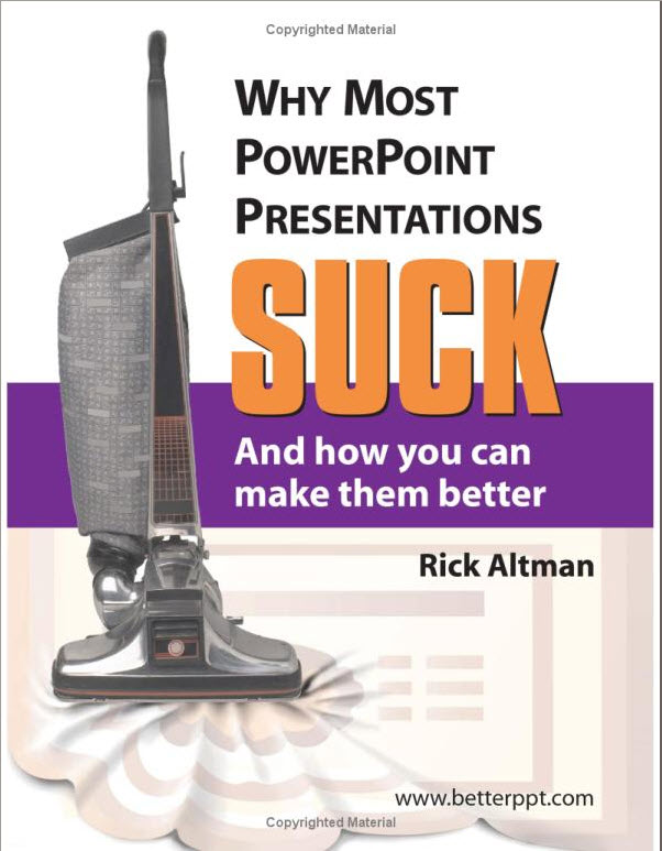
    Book Cover - Why Most PowerPoint Presentations Suck...

    Buy this book!

    I just started reading Rick Altman’s totally irreverent – and totally relevant book this past weekend. I love this book! Even better, I love the advice that Rick share with his audience.

    How many time have you sat in the audience while the presenter proceeded to read the slide – “word-for-word.?”

    Better question – How many times have you – the presenter – read your slides “word-for-word?”

    The answer to both questions – “Way too many times!”

    Now, we can’t directly change how other people choose to present – unless they are are one of our direct reports; or, they come to us seeking coaching on their presentations. However, we can implement “Preventive PowerPoint Practices” to improve our own presentations.

    Rick helps us with 2 “Universal Axiom’s:

    Universal Axiom #1:

    “If a slide contains complete sentences, it is practically impossible for even the most accomplished presenters to avoid reading the entire slide word for word.”

    Universal Axiom #2:

    “When you read your slides word for word, you sound like an idiot.”

    So what is the solution? How can you implement”Preventive PowerPoint Practices?”

    Simple – Do not put complete sentences on your slides!

    I can attest to this first hand. From time to time, I deliver training using PowerPoint slides created by my client. Many of the slides contain complete sentences hiding as “bullet points.” I have to really force myself to not look at the slides lest I succumb to the temptation to “read the slide word-for-word.” And I am an experienced presenter. I have to consciously remind myself to look at the audience and not at the slide!

    It is so much easier when you implement “Preventive PowerPoint Practices” – Do not put complete sentences on your slides!

    The Four-by_Four Rule

    In an earlier post, I demonstrate the “Four-by-Four Rule for PowerPoint”

    1. No more than “Four” Bullet Points per Slide.
    2. No more than “Four” words per Bullet Point.

    Read Rick Altman’s Book – “Why Most PowerPoint Presentations Suck… And How You Can Make Them Better.”

    Go back to ALL of your PowerPoint Presentations and remove Every Complete sentence. Now – before you forget.

    There is one exception to this rule: If you are using a quotation on your slide. A good quotation is usually brief. Just make sure that you choose a quotation that complements your point.

    News! My new DVD, “The 50 Best Tips for PowerPoint 2007” is available for purchase. Visit my online store for details.

    Share and Enjoy:
    • Add to favorites
    • Facebook
    • Twitter
    • Technorati
    • Print
    • email
    • Digg
    • StumbleUpon
    • del.icio.us
    • Yahoo! Buzz
    • Google Bookmarks
    • Orkut
    • SphereIt
    • Sphinn

    How to edit text in your slides

    Here are the take-aways for this lesson:

    1) Create slides that reinforce your message; your slides should not repeat your message

    2) The “Four-by-four” Rule: No more than 4 bullet points; nor more than 4 words per bullet point

    3) Ctrl+D is the shortcut for Duplicating a slide

    News! My new DVD, “The 50 Best Tips for PowerPoint 2007” is available for purchase. Visit my online store for details.

    Related Videos

    Share and Enjoy:
    • Add to favorites
    • Facebook
    • Twitter
    • Technorati
    • Print
    • email
    • Digg
    • StumbleUpon
    • del.icio.us
    • Yahoo! Buzz
    • Google Bookmarks
    • Orkut
    • SphereIt
    • Sphinn

    The proper use of charts and graphs

    Seth Godin wrote a very useful article, “The three laws of great graphs” on his blog today. Read it. And put a copy of this in the folder of materials for your next presentation. Keep it handy. Heeding Seth’s advice will payoff.

    And that’s exactly what you want when you insert a chart or a graphic in your PowerPoint slide – a big payoff! Nothing less.

    And… certainly nothing else. As Seth correctly points out – a PowerPoint slide, shown in a dark ballroom to 1,000 people, is not the time to point out nuances.

    You want your audience to say (to themselves) “Aha! Now I see it. Now I get it. This really is a big problem!”

    A picture is worth a thousand words – if used effectively. Let your graphic speak for itself. Let your audience see the big picture – for themselves!

    A poor choice of graphs is like a bad joke. If you have to explain it … Better not to use it.

    News! My new DVD, “The 50 Best Tips for PowerPoint 2007” is available for purchase. Visit my online store for details.

    Share and Enjoy:
    • Add to favorites
    • Facebook
    • Twitter
    • Technorati
    • Print
    • email
    • Digg
    • StumbleUpon
    • del.icio.us
    • Yahoo! Buzz
    • Google Bookmarks
    • Orkut
    • SphereIt
    • Sphinn

    Learn to use keyboard shortcuts to navigate your slides

    The Tech Republic website posted a nice compact listing of keyboard shortcuts that you can use to navigate forward and backwards during your MS PowerPoint slide shows.

    The list is compact. It is not comprehensive. It doesn’t need to be. You have enough on your mind as you prepare to run your show. Master just a few of the keyboard shortcuts and you will add to your level of confidence.

    Did you realize that you can “blank” the screen during you slide show? You might want to do this during a Question & Answer session, for example.

    The “B” key will give you a “Black” blank screen. And the “W” key will give you a “White” blank screen. To return to your slide show, click either the “B” or the “W” key – they are “toggle” shortcuts.

    Remember to keep the focus on you and your message – not on the PowerPoint slides!

    News! My new DVD, “The 50 Best Tips for PowerPoint 2007” is available for purchase. Visit my online store for details.

    Share and Enjoy:
    • Add to favorites
    • Facebook
    • Twitter
    • Technorati
    • Print
    • email
    • Digg
    • StumbleUpon
    • del.icio.us
    • Yahoo! Buzz
    • Google Bookmarks
    • Orkut
    • SphereIt
    • Sphinn

    How many slides should I use?

    My clients frequently ask me “How many slides should I use in my presentation?”

    It is a good question. Unfortunately… there is no “hard and fast” rule to answer it.

    However, there are several guiding principles that can help us to decide how many – or how few – slides to include in each presentation. Today, I will share 3 guidelines including Guy Kawasaki’s “10/20/30 Rule for Powerpoint.”

    Search my Index of PowerPoint Video Lessons to find a specific topic.

    News! My new DVD, “The 50 Best Tips for PowerPoint 2007” is available for purchase. Visit my online store for details.

    Related Videos

    Share and Enjoy:
    • Add to favorites
    • Facebook
    • Twitter
    • Technorati
    • Print
    • email
    • Digg
    • StumbleUpon
    • del.icio.us
    • Yahoo! Buzz
    • Google Bookmarks
    • Orkut
    • SphereIt
    • Sphinn

    My First PowerPoint Presentation

    Here are the points covered in this lesson:

    1. Use the AutoContent Wizard to create your presentation
    2. Navigate your slides during your presentation
    3. The three keys to an effective presentation

    News! My new DVD, “The 50 Best Tips for PowerPoint 2007” is available for purchase. Visit my online store for details.

    Related Video Lessons

    Share and Enjoy:
    • Add to favorites
    • Facebook
    • Twitter
    • Technorati
    • Print
    • email
    • Digg
    • StumbleUpon
    • del.icio.us
    • Yahoo! Buzz
    • Google Bookmarks
    • Orkut
    • SphereIt
    • Sphinn

    Welcome to the PowerPoints Blog!

    The purpose of this blog is to provide tips and insights to help you create a strong message and to present your points with power. Sometimes you will use MS PowerPoint as one tool to help you with your presentation. But not always.

    I will post many articles to help you get the the most out of PowerPoint. And I will upload numerous video lessons demonstrating PowerPoint techniques. However, the content of this blog will not be limited to discussing PowerPoint.

    My focus is on helping you to communicate effectively.

    Never confuse PowerPoint slides with your message!

    As someone once asked, “Did Abraham Lincoln need PowerPoint to deliver the Gettysburg Address?” It is a silly question, of course. But it makes a powerful point:

    PowerPoint, alone, can not craft a powerful and persuasive presentation.

    PowerPoint does not deliver your message. You do!

    I invite you to return to this site on a regular basis. If you find the content useful, please book mark it or subscribe to my RSS feed. And tell your friends and colleagues about this site.

    I also invite you to add your comments, questions or suggestions. You can do so on this site. Or you can email me directly – danny@thecompanyrocks.com

    Thank you for visiting!

    News! My new DVD, “The 50 Best Tips for PowerPoint 2007” is available for purchase. Visit my online store for details.

    Share and Enjoy:
    • Add to favorites
    • Facebook
    • Twitter
    • Technorati
    • Print
    • email
    • Digg
    • StumbleUpon
    • del.icio.us
    • Yahoo! Buzz
    • Google Bookmarks
    • Orkut
    • SphereIt
    • Sphinn

    Death by PowerPoint – Part 2

    I was just re-reading “What Clients Love,” by best selling author Harry Beckwith.  Under the heading, “Lincoln Had No Slides at Gettysburg,” Beckwith offers some classic advice about how to avoid the mistakes that arise froman over-dependence on PowerPoint when making a speech or a presentation:

    1) You are not selling the slides, you are selling the people who are clicking the slides.

    2) When prospects gaze at slides, they are not looking at what you are selling: you and your ideas!

    3) Use slides only to illustrate a point that you cannot express as well with words alone.

    4) A slide filled only with words is neither a visual nor an aid.

    5) Make contact with your audience – you must look into their eyes and let the audience look into your eyes.

    Thank you Harry.  Your advice is invaluable.

    Personally, I think that many presenters use PowerPoint for their own selfish reasons. Rather than just outline their talking points (so that they remember what they are going to say) presenters create PowerPoint slide shows.  They think – wrongly – that “if my outline presents my ideas in a logical fashion, why not add some graphics and show the audience how clever I am with PowerPoint!”

    As Mr. Beckwith reminds us, the audience is not interested in how clever you are.  They are interested in your ideas – as they pertain to their interests.  However, the audience is most interested in you – how capable you are in executing the ideas that you are presenting.  And… how well you connect with your audience – your clients.

    I wonder what would have happened if Lincoln had, in fact, used PowerPoint to “enhance” his speech on the battlefield at Gettysburg?  It would have been easy to fit such a short speech (“Four Score and …”) up on a screen.  But would we have remembered the speech?  Or just read the words ourselves?  And, it might have been a challenge to find the right visuals – hard to top the stark visual presented by the battlefield itself. 

    Think about this the next time you are preparing for a presentation.  No slide show can ever cover-up your weaknesses.  Present yourself.  Make contact.  Leave a lasting impression.

    Share and Enjoy:
    • Add to favorites
    • Facebook
    • Twitter
    • Technorati
    • Print
    • email
    • Digg
    • StumbleUpon
    • del.icio.us
    • Yahoo! Buzz
    • Google Bookmarks
    • Orkut
    • SphereIt
    • Sphinn