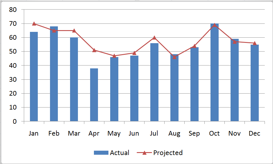
A combination chart in Excel is not a single chart type. Rather, you create combination charts by combining two or more complementary chart types. The most common combination is a Column type for one series and a Line type chart for the second series. Combination Charts, in general, make it easier to spot or highlight the trends in your data.
Creating a Combination Chart
- Create a standard chart for your data.
- Select one series and then choose a different chart type for that series.
- Make formatting choices as necessary.
Adding a Secondary Axis for Data
When you are comparing data series that have a wide “gap” between them – e.g. comparing actual sales in a month (large number) – to Profit % in each month (small number), you will want to create a Secondary Vertical (Value) Axis in your Combination Chart.
Begin by selecting the series that you want to plot and Right Mouse Click to Format the Series on a Secondary Vertical Axis. I recommend that you add in Axis Titles for both the Primary and Secondary Vertical Axes.
Formatting Charts in Excel 2007 and 2010
Charting in Excel – beginning with Version 2007 – now offers quite a few professional graphic design elements. In this video lesson, I show you how to customize the presentation of your graphical image. You can make these changes with just a few mouse clicks! It is definitely worthwhile to learn how to improve the visual impact that your Combination Charts make.
Learn how to “Master Excel in Minutes – Not Months!”
Subscribe to or watch my – free – video podcast on iTunes.


Speak Your Mind