A Pivot Table is a great way for you to summarize and present the information contained in your data set. When you apply conditional formatting to your Pivot Table, you can “visually” spot important trends or anomolies in your data.
Improvements to Conditional Formatting
Beginning with Excel 2007, Conditional Formatting has been dramatically improved. In addtion to pre-built formula rules, you can also apply Data Visualizations (Icon Sets, Data Bars and Color Scales).
Conditional Formatting for Above Average
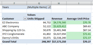
In this lesson, I apply the pre-built “Above Average” rule. I want Excel to dynamically format the summary values that answer, “TRUE” to this question: “Is this value “Above the Average” in the range of cells selected?
This is the key to understanding how Conditional Formatting works. Special Formatting is applied only when the answer to your CONDITION (a rule or a formula) is TRUE.
Dynamically Filter Conditional Formatting
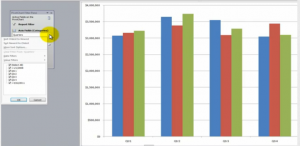
In this lesson, I use the Report Filter zone in my Pivot Table to see how conditions change when I change the time period in my report. Values that meet the Condition, “Above the Average,” receive the formatting that I established in my rule. Try this on your Pivot Table. It is a wonderful tool to use in an Excel Dashboard.
View This Video Tutorial in High Definition
Follow this link to watch this lesson in High Definition on my YouTube Channel, DannyRocksExcels.
My Extended Length Pivot Table Video Tutorials
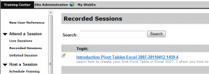
I offer “free of charge,” a 24 minute in-depth video tutorial for creating your first Pivot Table in Excel. Follow this link to learn how to view it online or to download it to your computer.
Vist My New Online Shopping Site
My new, secure online shopping website – http://shop.thecompanyrocks.com/ – is now open. I invite you to visit and learn more about the new products that I have added.
 How to Apply Conditional Formatting to a Pivot Table [ 6:01 ] Play Now | Play in Popup | Download (1642)