How to Quickly Clear All Text Formatting from PowerPoint Slides

Control Slide Formatting

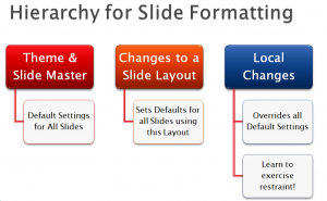
Use SlideMaster to Control Formatting

One of my clients inherited a “Ransom Note” PowerPoint Presentation. I think that you can visualize what a “Ransom Note” slide looks like: Multiple Fonts at various sizes with multiple colors and effects thrown in for good measure! Ugly and, certainly, not professional.

Steps to Clear All Text Formatting

In my video tutorial, I demonstrate:

  • How to work in PowerPoint’s Outline View
  • How to use Keyboard Shortcuts to expand and collapse the text for each slide
  • How to clear all of the text formatting

Use the SlideMaster to Set Default Settings for Text

In my experience, most of the people who use PowerPoint are either unaware of the SlideMaster or they do not know how to use it. In my tutorial, I demonstrate how Microsoft Office Themes and the SlideMaster work together to set the default setting for formatting your presentation.

Minimize Local Formatting

My goal, in creating this tutorial, is to impress upon you the importance of limiting your use of “local formatting.” The reason that “ransom note” formatting survives is a direct result of applying local formatting rather than using the SlideMaster to help you to maintain a consistent look.

Additional Resources for Learning PowerPoint

I am the author of the best-selling DVD-ROM, “The 50 Best Tips for PowerPoint 2007.Click on this link to learn more about the 7 1/2 hours of focused video training that I offer on my DVD-ROM.

Watch My Tutorial in High Definition

Follow this link to view my tutorial in High Definition on my YouTube Channel – DannyRocksExcels


I Added a New PowerPoint Video Lesson

I am just getting back to adding more PowerPoint Video Lessons on my blog. Follow this link to view the video – “Tools To Control Text On Slides”

The key learning points in the lesson:

  • Enforce a style to limit the number of bullet points per slide.
  • Establish a style to maintain consistent ending punctuation (on or off) for bullet points.
  • Establish minimum font sizes for Slide Titles and bullet points.

Reduce “Visual Clutter” on your PowerPoint slides. Achieve the professional look that sets you apart from other presenters. Use the tools that PowerPoint provides to help improve Visual Clarity.

An experiment – do you prefer the written article or the spoken PowerPoint?

The Written Word

Yesterday, I published an article – “How Many Words per Minute (WPM) Do You Speak?”

The Spoken Word

Today, I recorded a PowerPoint presentation based on that article – “Did I Get My WPM Count Just Right?

Both postings discuss the same topic – How fast or slow do you speak? What is your spoken words-per-minute (WPM) count. Each posting offers a different experience.

I had a different experience while creating and recording the PowerPoint presentation. I needed to add extra words to assist the viewer. Both the video and the article are designed to “stand alone.” However, I felt that the video “needed more explanation.” I had to remember that the viewer could hit the “back button control” on their web browser at any moment!

Write Your Presentations / Practice Speaking Your Words

Perhaps it was just the experience of speaking my written words aloud. A practice that I recommend that all writers and editors try at least occasionally. Perhaps it was just me “wishing that I had taken more time in editing yesterday’s article.” A case of “writer’s remorse?

I hope that you will take some time to read the article AND to view the PowerPoint presentation. I welcome your feedback. Which medium did you prefer – and why? What would you like to see more of? Less of?

Please add your comments below. Or you can email your comments to me – danny@thecompanyrocks.com

How many slides should I use?

My clients frequently ask me “How many slides should I use in my presentation?”

It is a good question. Unfortunately… there is no “hard and fast” rule to answer it.

However, there are several guiding principles that can help us to decide how many – or how few – slides to include in each presentation. Today, I will share 3 guidelines including Guy Kawasaki’s “10/20/30 Rule for Powerpoint.”

Search my Index of PowerPoint Video Lessons to find a specific topic.

News! My new DVD, “The 50 Best Tips for PowerPoint 2007” is available for purchase. Visit my online store for details.

Related Videos