This is Part 2 of my 2-part series on Excel Pivot Table Frequency Reports. A Frequency Report is a great way to answer these questions:
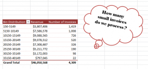
- How many invoices did we generate for values under $5,000?
- How many invoices did we gererate for values over $15,000?
In this part, I show you how to format the Frequency Report to make it easier to present the information.
Formatting the Frequency Report
Here are the changes that I made to improve the look of the Frequency Report:
- Reduced the number of “bins” in the frequency range by changing the “Grouping.”
- Changed the formatting to make large numbers (millions) easier to read – e.g. as $3.2M
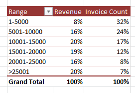
- Made a copy of the Pivot Table to show values as “% of Total.”
Learn How to Use Pivot Tables
I have created a series of video tutorials that you can download to learn how to create and modify Excel Pivot Tables. You can choose to download the recording that fits your version of Excel (2003, 2007 or Excel 2010). The cost is $9.95 for the video recording and that includes the Excel workbooks that I used and a step-by-step instructional manual. Follow this link to get more information about these recordings.
Watch this Video in High Definition on YouTube
Follow this link to watch this video tutorial on my YouTube Channel – DannyRocksExcels
